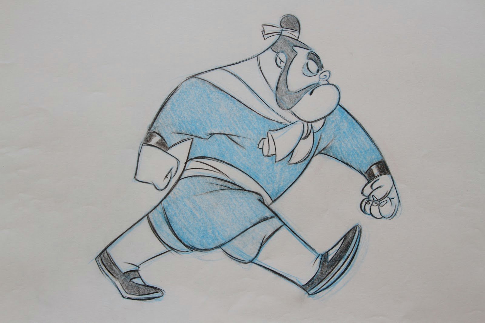
Here is a new oil painting I just completed as a commission for a private client. I’ve included a step by step process. .

It starts with me doing a digital comp in photoshop. I can easily work out all of my compositional problems at this stage.

I then print out my image and grid it so that transfer to the large canvas is quicker and easier. I grid the canvas the same way and begin to transfer the drawing.

Ugh!! A blank canvas…such a long road ahead!

Beginning to draw in charcoal pencil. I use charcoal pencil so that I am able to produce details in the drawing. I like to get as much information in the drawing as possible before I start to paint. Notice the grid on the canvas.

Continuing on the drawing…

The finished rough sketch on the canvas. Although I want a fair amount of detail in the drawing, I’m not trying to make it look pretty at this point.

This next step is very important to me. After sealing the drawing with Final Fixative, I then tone the canvas with an underpainting. I like to rough in the basic color of what the objects in the painting will ultimately be. I do this for two reasons: 1. If for some reason I neglect to cover a small portion of canvas, I won’t have glaring white showing through, but most importantly, 2. It knocks the white of the canvas down into the midtone range. When painting on a midtone you can more easily judge the lights and darks that you’re applying.

Now it’s time to start painting. Here I’ve started with the face of the male lion.

I continue into the mane. Notice that I apply my darks first then work lighter.

As the head of the lion began to develop, I felt it was time to start laying in the background to get the lion to sit in it’s environment.

I then jump back to the lion and continue with the mane and roughing in his body.

Here I’ve gone back to the background to lay in more savannah. Also, notice that I’m starting to build up color and texture, particularly in the body of the male lion. When I rough in an area, I like to let it set for a day or two and dry. I then can start to scumble other colors over the roughed in area. I particularly like to play with color temperature at this stage. This builds volume, texture, color and just generally makes the area more interesting to look at.

After adding more texture and interest to the background, it’s time to start work on the lioness.

I continue working on the lioness, but I’m also starting to jump around the painting at this point. Colors going into the lioness will get scumbled into the male’s body and vise versa. I’m also continuing with the mane.
Here I’ve finished with the lioness and have gone onto the finishing touches in the foreground and background grasses.

Here I am putting some of the finishing touches on the grasses. I particularly like this shot because it shows off the texture of the painting itself. I like paintings to have brush and paint texture. I actually like to run my hands over the painting after it’s dry.

Here I’ve posed with the painting thinking I was done. The next day though after looking at it, I decided to add a few more darks in the tall sprigs of dried grass.

“Protecting the Queen” 36″X48″ Oil on Canvas

I painted this Great Blue Heron after waking this morning and watching him from my bedroom balcony. It’s painted in CS6 and I’ve included the steps taken in producing it.

I start with a warm midtone back ground.

I then add a level and set it to multiply and add various textures. This will come in handy when I paint the algae covered rocks.

Here I’ve created another level and have roughed in the drawing. It’s important to have good reference!

Here I’ve created yet another level and set it to multiply to retain the texture underneath and roughed in the local color.

Here I’ve created a level under the drawing layer and layed in the basic water color and value.

This was a slight adjustment, but I didn’t like the angle of the head so I brought it down a little and fixed the beak. I also lightened the body of the heron a bit.

Now it’s time to start roughing in color. It’s also the stage where I start to pull out some of the detail.

I continue this on the rocks. I also roughly lay in the color for the dead grasses.

Here I’ve created another layer for laying in final details. I go back and forth between my rough color layer and my final detail layer constantly.

At this point I felt it was time to lay in the water. Water is a tricky, subtle thing. It takes lots of observation to understand how the reflections, and lighting of water works. It can get away from you very easily.

Here I went back to my final detail layer and continued on with the heron and the rocks.

Here I finished things off by working out the grasses. I also darkened the bottom of the piece to balance it out a little better.
I intended the piece to look as if the heron was fishing but I felt it still lacked a little of the “story” aspect to it, so I added the ripples of a fish just having hit the surface.

Here is a new Photoshop creation and the steps taken to create it.

I start with my rough sketch on it’s own level on a mid tone background.

I then lighten the rough sketch, then create a new layer and refine the drawing.

Next I create a layer under the drawing layers and lay in my local color. Local color is the color of an object in neutral lighting.

I then create a new layer on top of the local color layer but under the drawing layers. I set it to multiply, pick a cool, blue gray and begin to lay in my shadows. I imagined the light to be straight up out of frame. It’s important to really think about the form at this stage.

I now add a layer on top and start to lay in my light areas. I generally grab the local color with the eyedropper then lighten and warm the color for the lights.

Here I create a new layer under the light layer but above the drawing layer. I set it to multiply and begin to lay in the deep darks. I’m constantly going back and forth between light and dark to let the image develop evenly. I’ve also added a layer of reflected light. It can be seen under the nose and some of the branches.

I often like to add a secondary light source. It adds interest and helps describe the form more.

Here I’ve continued with my deeper darks and I’ve started to lay in some mottling in the skin around the eye.

This stage is fun. I take many digital photos of my face and rough wood. I then grab sections of those photos and lay them over the painting. I drop the opacity and increase the contrast so that the painting will show through but still have the texture above it. Here you can see I’ve layed in the facial and wood textures. It’s subtle but goes a long way. I also go back in above the texture layer and define the highlights even further.

Here I’ve decided a wanted a very realistic eye. I took a picture of my own eye then lassoed it and dragged it over and added it to the illustration.

At this point I felt it was time to add a background. I grabbed a section of a photo I had in my collection of a flower garden and dragged it over and blurred it. I then added a subtle layer of light rays.

Here I’ve added a layer of particulate in the air and started to play with the focus. I’ve also added a layer of out of focus foliage in the foreground.

Next I combine all of my layers. Be sure to do this as a copy so that you can retain your original layers. Then on my combined layer I start to color dodge some of the highlight areas to give it a hotter feel.

The finishing touch is adding a layer of grunge texture set to multiply. I like the feel that it gives the illustration.

A new character design done today in Photoshop.

A new character design done today in Photoshop.

I’ll be teaching my techniques for doing character pieces such as this for film at the Photoshop World Conference in Orlando, Florida, April 17-19.  photohopworld.com


The King of the Elves -Elves/Hidden Creature designs.

These are a series of characters I designed for a film I was developing a few years ago. Creating fantasy creatures like these is a joy for me. When I was young growing up in the Everglades of south Florida I spent a large amount of time out in the swamps and forests drawing and painting. I often imagined that there were creatures there that I couldn’t see. I’d like to add that these were all done well before Avatar.

I love painting gulls. Here is a new step by step of a pair of Laughing Gulls I digitally painted last night.

So, once again I like to start with a textured, toned background. This is several watercolor textures I have in my files layered and set on multiply over a warm tone.

Next,I played with the textures a bit more and roughed in the gulls.

I wanted to play with warms and cools in this piece so I next layed in a blue gradient tone. I also added shadow tones in the foreground for composition. The gulls also got shifted up a bit.

After looking at the composition in reverse, I decided to once again move the gulls over slightly. This is also where I create a new layer under the drawing layer, set it to multiply, and rough in the tones on the gulls.

Because of the feather detail, I decided I wanted to tie the drawing down, so I turned the texture levels off so that I could see the drawing layers better and begin to tie down the drawing.

Tied down drawing with layers turned back on.

Once again I wasn’t quite happy with the gulls compositionally, so I enlarged them a bit. This I felt was more pleasing.

Now I’m ready to start rendering my values further. This is where I also start paying particular attention to color temperature. Especially between shadow areas and light areas.

Notice that the feathers in shadow tend to reflect back the color of the sky where they face up and the warmth of the ground where they face down. Getting these color temperature changes right will really get your subject to sit in it’s environment not to mention increase the sense of actual light. At this point I’ve also roughed in the light and shadow shapes of the back and wings.

Here I’ve rendered the feathers of the back.

Time to get to gull number two.

Here I just use my eye dropper to grab the same colors of the first gull and I begin to render the second gull.

Once the second.gull was rendered out I felt the background needed to darken. I wanted to get the gulls to pop better and have a better sense of light.

At this point it’s a matter of laying in the ground texture and shadows. Here I kept things loose and really just played with texture, value and color. I really pushed the blues in the shadows to play against the strong oranges, browns and reds of the seaweed.

As a final touch I compressed all the levels and color dodged the warm areas around the gulls on the ground to warm, and brighten it up. It gives a much better sense of light.

One of my digital animal paintings, step by step

I first like to start with a textured, toned background.

I then rough in the layout. This is where I resize and move things around to get the composition right.

I then lighten that level, and create a new level to start the more refined rendering.

Once the drawing is done I roughly start laying in local color. I set this level on multiply so that I can retain the texture underneath.

At this point I create a new layer and begin to find my darks and lights. I also pay particular attention to color temperature at this point. In a dominantly warm or cool piece hitting just the right amount of opposite temperature can really make a piece sing.

At this point I’m going in between light, dark, warm and cool. Cool doesn’t necessarily mean colors in the blue, violet and green range. I’m really playing with varying temperatures of the earthy ocher colors of the lion’s coat.

At this point I start to add the details of the background. This is where the texture that I started with really comes in handy. I really let it do a lot of the work. It surprising how little detail you really have to create in order to convince the viewer they are looking at a field of grass.

I continue adding the details to the background. I make sure to pay attention to color temperature just as in the lion. Also adding small indications of detail such as the little white flowers or the dried orange leaves really get the whole thing to sing. It’s important not to overdo this. A little will get you a lot.